Make production transparent. Try MDCplus
Try it yourself Get guided demo14 August 2026
How Do You Build a Mobile Dashboard Plant Managers Actually Use?
Building a mobile-first Tailwind PWA for plant managers: what belongs on a phone screen, offline behavior, push notifications, and prompts for an executive manufacturing dashboard
How Do You Build a Mobile Dashboard Plant Managers Actually Use?
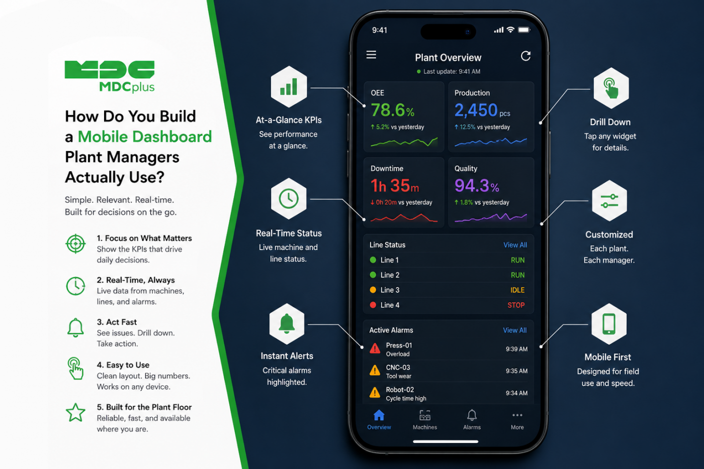
Short answer: build a PWA that answers one question — "is anything wrong right now?" — above the fold, works when the phone drops to one bar in the middle of the plant, and pushes notifications only for things worth interrupting someone about. The mistake that kills these projects isn't technical: it's shrinking a desktop dashboard onto a phone. A plant manager on their feet has fifteen seconds and one question, and a responsive grid of twelve KPI cards answers it badly. This article covers what belongs on the screen, the offline and notification behavior that makes it dependable, and the prompts to get there.
Copy this prompt to get started
Build a mobile-first Progressive Web App dashboard for plant managers using React and Tailwind. Design for one-handed use on a phone, in a factory, by someone walking.
Screen 1 (the only screen that matters): an "everything OK / needs attention" answer above the fold. Show total output vs. target for the current shift, count of machines currently down, and count of active incidents. Nothing else above the fold.
Requirements: single-column layout, no horizontal scrolling, tap targets 48px minimum, thumb-reachable primary actions in the lower half of the screen. Include a visible "last updated" timestamp and pull-to-refresh. Show cached data with a clear stale indicator when offline rather than an error screen. Configure a service worker to cache the app shell and the last successful data response. Include a web app manifest for home-screen installation.
Do not build a responsive version of a desktop dashboard — design for the phone first. End with a list of assumptions you made.
Contents:
- Designing for the actual context of use
- What belongs on a plant manager's phone
- Why a PWA rather than a native app
- Offline behavior on a factory floor
- Push notifications without alert fatigue
- Layout for one-handed use
- Drill-down: how deep is too deep
- Common pitfalls
- Frequently asked questions
- Conclusion
Designing for the actual context of use
Every design decision here follows from where this gets used, which is not at a desk:
- Standing, walking, or between meetings. Sessions are seconds, not minutes. Anything requiring sustained attention won't get it.
- One hand. The other is holding a coffee, a door, or a phone call. Anything in the top corners of a large phone is effectively out of reach.
- Poor connectivity. Plant interiors are hostile to cellular signal — metal structures, thick walls, dead zones between buildings.
- Interruption-driven. Managers usually open this because something happened or because they're checking in, not to browse. The app should answer immediately, not present a menu.
- Often in bright light or moving between light conditions. Contrast matters more than on a desktop screen.
This is a genuinely different design brief from the wall-mounted displays covered in our piece on Andon display design — that screen is read at ten meters by operators; this one is read at arm's length by one person who wants a summary and then wants to act.
What belongs on a plant manager's phone
| Belongs above the fold | Belongs one tap deeper | Doesn't belong on a phone at all |
|---|---|---|
| Output vs. target, current shift | Per-line or per-cell breakdown | Detailed time-series charts |
| Machines currently down (count) | Which machines, and for how long | Raw telemetry values |
| Active incidents (count) | Incident detail and who's on it | Multi-dimensional pivot analysis |
| An unmistakable "all normal" state | Shift-over-shift comparison | Configuration and admin screens |
The "all normal" state deserves specific attention. Most dashboards are designed around problems and look identical whether things are fine or mildly concerning, which forces the viewer to read and interpret every number. A screen that says clearly and immediately that nothing needs attention is more valuable than one showing six green metrics — it converts a fifteen-second scan into a one-second glance, which is the difference between an app people check and one they stop opening.
Why a PWA rather than a native app
For an internal manufacturing tool, a PWA is usually the right call:
- No app store distribution. Internal tools don't belong in public stores, and enterprise distribution is administrative overhead most plants don't need.
- One codebase, one deploy. Updates land immediately for everyone rather than depending on users updating an installed app.
- Home screen installation still works. A PWA with a proper manifest installs to the home screen and launches full-screen, which covers most of what "feels like an app" actually means to users.
- Service workers give real offline capability — the main technical reason people historically reached for native.
The honest limitations: push notification support and background behavior differ across platforms and are less consistent than native, and deep OS integrations aren't available. For a dashboard that shows status and alerts, those constraints rarely bite.
Offline behavior on a factory floor
Connectivity inside a plant is genuinely bad in places, and a dashboard that shows a connection error in a dead zone gets abandoned quickly. The behavior that works is showing the last known data with an honest staleness indicator:
Implement a stale-while-revalidate pattern with the service worker: always render cached data immediately, then update if a fresh fetch succeeds. When offline or when the last successful fetch is older than 2 minutes, show a persistent banner stating exactly how old the data is — "Data from 14 minutes ago" — and visually mute the metric values so they don't read as current. Never show a blank screen or a connection error in place of cached data.
Two things matter here. The staleness indicator must be prominent, not a subtle timestamp — the failure mode being defended against is a manager confidently acting on twenty-minute-old numbers. And the cached-data-with-warning approach is strictly better than an error, because "the line was running fine 14 minutes ago" is still useful information.
Push notifications without alert fatigue
Notifications are the feature most likely to make this app genuinely valuable and also most likely to get it muted permanently within a week. The discipline is entirely about threshold, not implementation.
- Only notify for things warranting an interruption. A machine down for two minutes is not that. A bottleneck machine down for twenty, or a line stopped, probably is.
- Use duration thresholds, not instant triggers. Most stops resolve themselves. Notifying after a stop persists past a threshold filters out the noise automatically.
- Deduplicate aggressively. One notification per incident, not one per state change. A machine cycling between fault and idle should not generate fifteen alerts.
- Respect shift boundaries. Notifying a day-shift manager at 3am about a night-shift issue teaches them to disable notifications entirely.
- Make every notification actionable. If there's nothing the recipient can do, it's a report, not an alert — and it belongs in the app, not on the lock screen.
A reasonable starting configuration is few and meaningful: line stopped, bottleneck machine down beyond threshold, shift target at risk. Expanding from a narrow set is far easier than winning back attention after fatigue sets in.
Layout for one-handed use
Thumb reach on a modern large phone covers roughly the lower two-thirds of the screen, and the top corners are essentially unreachable one-handed. That inverts some desktop habits: primary actions belong at the bottom, not in a top-right corner, and navigation belongs in a bottom bar rather than a top hamburger menu.
Other specifics worth prompting for: single-column only (side-by-side cards on a phone produce text too small to scan while walking), no horizontal scrolling anywhere, pull-to-refresh as the refresh gesture rather than a button, and 48px minimum tap targets — larger if there's any chance of gloved use.
Drill-down: how deep is too deep
Two levels is the practical limit: summary, then detail. A manager who needs a third level of depth needs a laptop, and building it into the phone app means maintaining screens nobody uses.
The useful pattern is that every number on the summary screen is tappable and leads to exactly one detail view answering "why is this number what it is." Machines down leads to which machines and for how long; output vs. target leads to the per-line breakdown. Beyond that, a link out to the full dashboard covered in our piece on vibe-coding a shop floor dashboard is a better answer than a cramped third level.
Common pitfalls
- Shrinking a desktop dashboard. The root cause of nearly every unused mobile manufacturing app. Design for the phone first or don't bother.
- An error screen instead of cached data. Guarantees abandonment given real plant connectivity.
- No prominent staleness indicator. Turns the offline feature from helpful into dangerous.
- Too many notifications in the first week. Attention is spent once; get the thresholds conservative before rollout.
- Charts on the summary screen. A sparkline is fine; a real time-series chart is unreadable on a phone while walking and pushes the actual answer below the fold.
- Login on every open. If a manager has to authenticate each time they check, they'll stop checking. Use long-lived sessions with device-level security.
Frequently asked questions
Is a PWA good enough, or do we need a native app?
For a status dashboard with alerts, a PWA is usually sufficient and considerably cheaper to build and distribute. Native becomes worth considering if you need deep OS integration or notification behavior more consistent than what PWAs offer across platforms.
How much data should the app cache for offline use?
Enough for the summary view and one level of drill-down — typically the last successful response, not a history. Caching extensive historical data adds complexity for a use case (offline trend analysis on a phone) that essentially doesn't exist.
What notification threshold should we start with?
Start conservative: line stopped, bottleneck machine down beyond a duration threshold, shift target at risk. It's far easier to add notifications after managers ask for them than to rebuild trust after they've muted the app.
Should operators use this app too, or just managers?
They're different products. Operators need machine-level detail and data entry at a specific station; managers need plant-level summary and alerts. Trying to serve both in one mobile app usually produces something that serves neither well.
Conclusion
A mobile manufacturing dashboard succeeds or fails on restraint. One question answered above the fold, cached data with an honest staleness warning instead of an error screen, and a deliberately narrow notification set are what separate an app plant managers actually open from one they installed once and forgot. The technical build — a Tailwind PWA with a service worker — is straightforward and well within what a few good prompts will produce; the discipline about what not to include is the part that requires an actual decision.
Related articles:
- How Do You Design an Andon Display Operators Can Read from 10 Meters?
- How Do You Vibe-Code a Real-Time Shop Floor Dashboard with Claude and Python?
- How Do You Generate Manufacturing KPI Widgets with Cursor and v0.dev?
- Feeding Machine Data into Custom Systems via API
- MDCplus Machine Connectivity & Integrations
About MDCplus
Our key features are real-time machine monitoring for swift issue resolution, power consumption tracking to promote sustainability, computerized maintenance management to reduce downtime, and vibration diagnostics for predictive maintenance. MDCplus's solutions are tailored for diverse industries, including aerospace, automotive, precision machining, and heavy industry. By delivering actionable insights and fostering seamless integration, we empower manufacturers to boost Overall Equipment Effectiveness (OEE), reduce operational costs, and achieve sustainable growth along with future planning.
Ready to increase your OEE, get clearer vision of your shop floor, and predict sustainably?
Other articles
14.08.2026
How Do You Build a Mobile Dashboard Plant Managers Actually Use?
Building a mobile-first Tailwind PWA for plant managers: what belongs on a phone screen, offline behavior, push notifications, and prompts for an executive manufacturing dashboard
Read more
13.08.2026
How Do You Create Manufacturing KPI Widgets with Cursor and v0.dev?
Using v0.dev to generate manufacturing KPI widgets and Cursor to wire them into an existing dashboard repo: the two-tool workflow, prompts for scrap rate and MTTR/MTBF, and integration pitfalls
Read more
12.08.2026
How Do You Build a 3D Shop Floor Map Driven by Live PLC Data?
Building a 3D shop floor map with React Three Fiber: preparing CAD geometry for the web, mapping PLC tags to mesh colors, performance limits, and when 3D is the wrong choice.
Read more
11.08.2026
How Do You Design an Andon Display For Shop-Floor Using AI?
Prompting UI/UX for shop floor Andon displays: type scale for distance viewing, colorblind-safe status coding, glare and glove constraints, and prompts that produce factory-ready screens
Read more
10.08.2026
How Do You Get Live OPC UA Machine Data into Retool?
How to vibe-code a Retool custom component that streams live OPC UA machine data over WebSockets: the bridge service, security boundaries, and prompts for each layer
Read more