Make production transparent. Try MDCplus
Try it yourself Get guided demo11 August 2026
How Do You Design an Andon Display For Shop-Floor Using AI?
Prompting UI/UX for shop floor Andon displays: type scale for distance viewing, colorblind-safe status coding, glare and glove constraints, and prompts that produce factory-ready screens
How Do You Design an Andon Display Operators Can Read from 10 Meters?
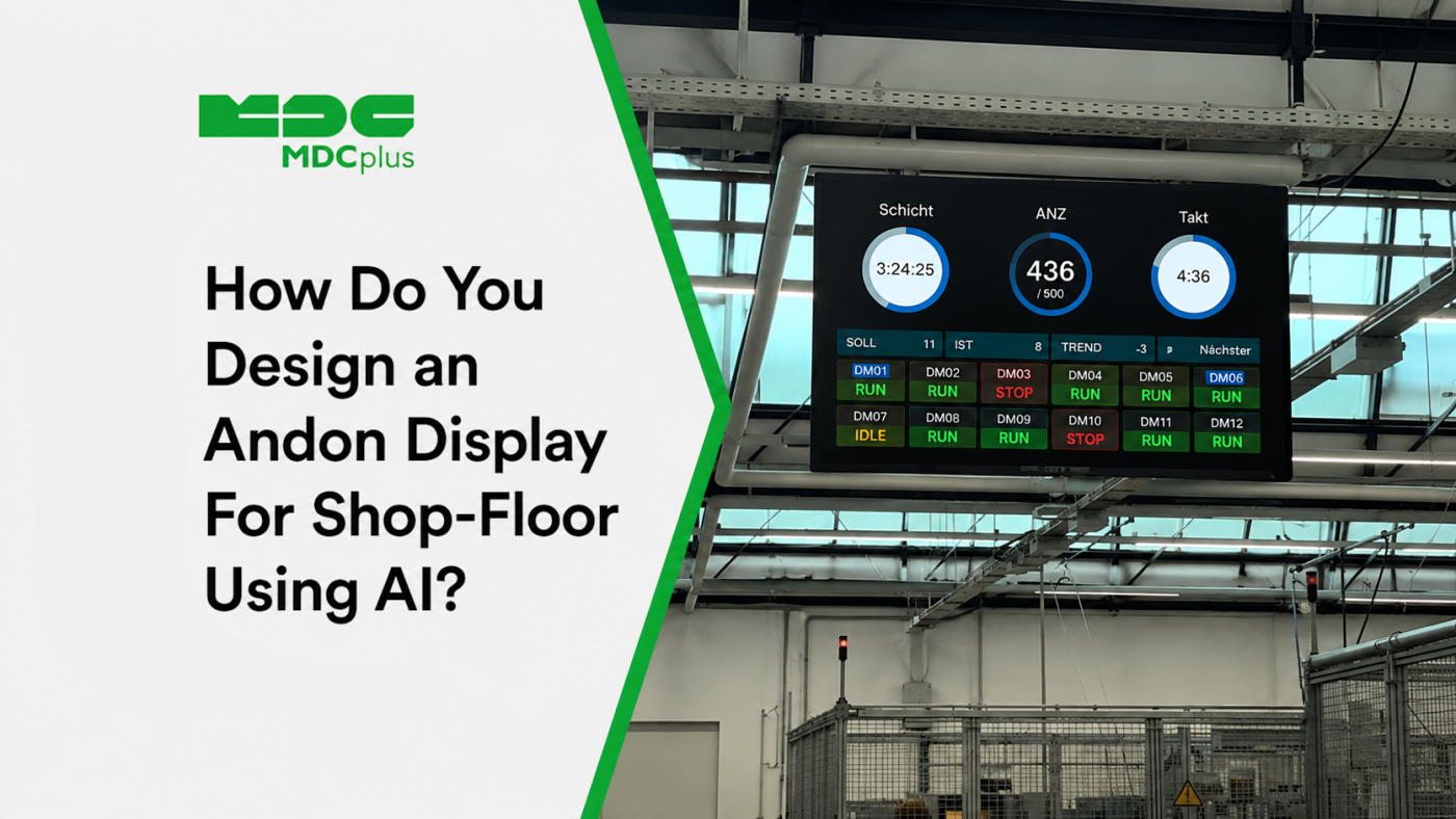
Short answer: design for one glance and one message per screen — status text at roughly 100–150px minimum, colorblind-safe status coding that never relies on color alone, and no element that requires walking closer to interpret. Models default to producing web dashboards for people sitting at desks, which is almost exactly wrong for a factory floor. This article covers the constraints that actually apply on a shop floor and the prompts that produce a screen operators can use, rather than a nice-looking dashboard nobody can read across a bay.
Copy this prompt to get started
Design a full-screen Andon display for a factory floor using React and shadcn/ui, in dark mode.
Hard constraints, all of which override normal web design conventions:
1. Primary status text must be legible from 10 meters — assume roughly 100–150px for status text, 48px minimum for any secondary text. Nothing smaller than 32px anywhere.
2. Status must never be communicated by color alone. Every state needs a distinct shape or icon plus a text label alongside the color.
3. Use a maximum of 6 status tiles on screen. If more machines exist, paginate — do not shrink tiles to fit.
4. No hover states, tooltips, or anything requiring a mouse. Assume no pointer input at all.
5. High contrast for a bright, sometimes glare-heavy environment. Avoid mid-tone greys.
6. Any interactive element must be at least 80px tap target, designed for gloved hands.
7. Show a "last updated" timestamp and a visually distinct state for stale or missing data.Explain any place where these constraints conflict with normal design practice, and end with a list of assumptions you made.
Contents:
- Why models get shop floor UI wrong by default
- Viewing distance and type scale
- Status coding that survives colorblindness
- Designing for the physical environment
- Information density: the one-glance rule
- Interaction design for gloved hands
- Failure states operators can interpret
- Testing a design before it goes on the wall
- Common pitfalls
- Frequently asked questions
- Conclusion
Why models get shop floor UI wrong by default
Ask for a "manufacturing dashboard" and you'll reliably get something that looks like a SaaS analytics product: 14px body text, subtle grey secondary labels, hover tooltips carrying important information, a dozen KPI cards packed into a grid. Every one of those choices is correct for a laptop screen and wrong for a wall-mounted display in a machine shop.
This isn't a model failure so much as a training-data reality: the overwhelming majority of dashboard UI in the world is designed for desk use, so that's the default. Getting factory-appropriate output requires stating the constraints explicitly, because the model has no way to infer that the viewer is 10 meters away, wearing gloves, possibly colorblind, and glancing for two seconds between tasks.
Viewing distance and type scale
The single most important variable is viewing distance, and it changes the design more than anything else. A rough working guide for planning:
| Viewing distance | Primary status text | Practical implication |
|---|---|---|
| 1–2 m (terminal at machine) | ~24–32px | Can show detail, tables, multiple metrics |
| 3–5 m (cell display) | ~48–72px | One machine group, few metrics each |
| 10 m+ (bay-wide Andon) | ~100–150px | Status only. Numbers are barely readable; color and shape carry the message |
These are starting points for prompting, not standards — actual legibility depends on screen size, resolution, lighting, and typeface. The important discipline is deciding the viewing distance before designing, and telling the model explicitly, because it silently drives every other decision.
One consequence worth internalizing: at 10 meters, a number like "OEE 73.4%" is mostly unreadable, while a large color block with a shape and one word is instantly parseable. Bay-wide Andon screens should carry state, not analytics — the metrics belong on the cell display or the manager's phone, covered separately in our piece on mobile dashboards for plant managers.
Status coding that survives colorblindness
Manufacturing's default status palette is red/amber/green, and red-green colorblindness affects roughly 8% of men — a demographic heavily represented on shop floors. A red/green-only Andon display is unreadable to a meaningful share of the people it exists for, and they generally won't report it.
The fix is redundant encoding — never let color be the only carrier of meaning:
- Shape. Running as a circle, stopped as a square, alarm as a triangle. Distinguishable at distance even in monochrome.
- Text label. The word "RUNNING" or "DOWN" alongside the color, large enough to read at the design distance.
- Position or motion. A pulsing border for an active alarm reads as urgent regardless of color perception.
- Blue instead of green. Where the palette allows, blue/amber/red is considerably more distinguishable than green/amber/red for the most common colorblindness types.
A useful prompt-level test: "Render this design in greyscale. Is every status still unambiguously distinguishable? If not, fix it."
Designing for the physical environment
- Glare and ambient light. Shop floors have overhead lighting, skylights, and reflective surfaces. Mid-tone greys that look elegant on a monitor disappear entirely under glare — push contrast well beyond what looks tasteful in an office.
- Dark mode isn't automatic. Dark backgrounds reduce glare and are usually right for dim areas, but a very bright bay can make a dark screen look washed out. Ask for both and test in place.
- Viewing angle. Wall-mounted screens are often viewed from below or off to one side; layouts that assume a straight-on view can lose their bottom rows entirely.
- Distance from dust and vibration. Less a UI concern than a reminder that the display hardware itself is in an industrial environment, and the software should survive a hard power cycle without needing someone to log back in.
Information density: the one-glance rule
The core discipline of Andon design is subtraction. An operator glancing up between tasks has roughly two seconds and one question: is anything wrong, and where? Every element that doesn't serve that question competes with the ones that do.
A practical constraint to put in prompts: a maximum of six status tiles, with pagination rather than shrinking if more machines exist. This forces the hard conversation about what actually belongs on a bay-wide screen versus a cell-level display. Fifteen tiny tiles isn't a denser Andon board — it's an unreadable one, and the failure is silent because it still looks organized from a laptop.
The concept itself predates screens entirely; our piece on how Andon reduces downtime covers the operational thinking, which is worth reading alongside the visual design, since a beautifully built display attached to no escalation process changes nothing.
Interaction design for gloved hands
Most Andon displays should be non-interactive — if it's mounted high on a wall, nobody is touching it, and any information behind a click is information nobody will see. Where the display is a touchscreen terminal at a machine:
- Tap targets of 80px or more. Standard mobile guidance (around 44px) assumes a bare fingertip; gloves need considerably more.
- No hover states, ever. They don't exist on touch, and any information conveyed only by hover is invisible.
- Forgiving inputs. Large buttons for common downtime reasons beat a dropdown with twenty options; the faster the interaction, the more consistently operators actually use it — which directly affects data quality, as covered in shop floor data quality.
- No text entry unless unavoidable. Typing on a shop floor terminal with gloves is slow enough that operators skip it, producing gaps rather than data.
Failure states operators can interpret
The most damaging Andon failure is a screen that looks normal while showing frozen data. An operator trusting a green tile for a machine that stopped reporting twenty minutes ago is worse off than one looking at a blank screen, because the blank screen prompts action.
Three states must be visually distinct at design distance: live and current, stale (data older than a threshold — grey out values, show elapsed time large), and disconnected (no feed at all — unmistakable, not a subtle badge). Prompt for all three explicitly; models produce only the first unless asked.
Testing a design before it goes on the wall
- Walk backward. Display it on the actual screen and walk to the real viewing distance. This takes two minutes and invalidates more design decisions than any amount of review.
- Squint test. Blur your eyes until detail disappears. What remains should still communicate machine state — that's what a two-second glance actually resolves.
- Greyscale test. Screenshot it, desaturate it, confirm every state is still distinguishable.
- Ask an operator, not a manager. The people using it will spot problems immediately that nobody reviewing it on a laptop will notice.
- Leave it running for a week. Frozen data, memory growth, and screensavers kicking in all surface over days, not minutes.
Common pitfalls
- Designing on a laptop and shipping without walking back. Almost every unreadable Andon screen was approved on a desk.
- Putting analytics on a bay-wide display. OEE trends belong where someone can stand and read them, not on a screen meant for glances.
- Colour-only status. Excludes a meaningful share of viewers, silently.
- Screensaver or sleep enabled. A dark Andon board is worse than no board; disable power management on the display device.
- No auto-recovery after reboot. The screen should return to the dashboard on power-up without anyone logging in.
- Alarm fatigue by design. If everything flashes red, nothing does. Reserve the loudest visual treatment for the states that genuinely require someone to walk over.
Frequently asked questions
What font size should Andon display text actually be?
It depends on screen size, resolution, and distance, so treat any number as a starting point rather than a rule: roughly 100–150px for primary status at 10 meters, 48–72px at 3–5 meters. The reliable method is displaying it on the real hardware and walking to the real distance.
Should Andon displays be dark mode or light mode?
Dark mode is the common default and usually right — less glare, and status colors pop against a dark field. But a very brightly lit bay can wash out a dark screen, so generate both variants and test in the actual location rather than assuming.
How many machines can one Andon screen realistically show?
At bay-wide viewing distance, around six status tiles before legibility degrades. More machines means pagination, grouping by line or cell, or a second screen — not smaller tiles.
Is shadcn/ui a reasonable base for this, given it's designed for web apps?
Yes, as a component foundation — but expect to override most of its type scale and spacing, since its defaults assume desk-distance viewing. The components are useful; the design tokens mostly aren't, which is worth stating in the prompt so the model doesn't preserve them.
Conclusion
Andon display design is mostly a discipline of removal and exaggeration: far larger type than feels reasonable, far fewer elements than seem possible, and redundant encoding so nothing depends on color alone. Models won't produce this by default because their training reflects desk-bound dashboards, so the constraints have to be stated explicitly and checked physically — display it on the real screen, walk to the real distance, and let an operator tell you what's wrong with it.
Related articles:
- How Andon Reduces Downtime in Production
- How Do You Vibe-Code a Real-Time Shop Floor Dashboard with Claude and Python?
- Data Quality on the Shop Floor: Common Pitfalls
- Vibe-Coding vs Low-Code: Which Is Better for Manufacturing Dashboards?
- MDCplus Machine Connectivity & Integrations
About MDCplus
Our key features are real-time machine monitoring for swift issue resolution, power consumption tracking to promote sustainability, computerized maintenance management to reduce downtime, and vibration diagnostics for predictive maintenance. MDCplus's solutions are tailored for diverse industries, including aerospace, automotive, precision machining, and heavy industry. By delivering actionable insights and fostering seamless integration, we empower manufacturers to boost Overall Equipment Effectiveness (OEE), reduce operational costs, and achieve sustainable growth along with future planning.
Ready to increase your OEE, get clearer vision of your shop floor, and predict sustainably?
Other articles
14.08.2026
How Do You Build a Mobile Dashboard Plant Managers Actually Use?
Building a mobile-first Tailwind PWA for plant managers: what belongs on a phone screen, offline behavior, push notifications, and prompts for an executive manufacturing dashboard
Read more
13.08.2026
How Do You Create Manufacturing KPI Widgets with Cursor and v0.dev?
Using v0.dev to generate manufacturing KPI widgets and Cursor to wire them into an existing dashboard repo: the two-tool workflow, prompts for scrap rate and MTTR/MTBF, and integration pitfalls
Read more
12.08.2026
How Do You Build a 3D Shop Floor Map Driven by Live PLC Data?
Building a 3D shop floor map with React Three Fiber: preparing CAD geometry for the web, mapping PLC tags to mesh colors, performance limits, and when 3D is the wrong choice.
Read more
11.08.2026
How Do You Design an Andon Display For Shop-Floor Using AI?
Prompting UI/UX for shop floor Andon displays: type scale for distance viewing, colorblind-safe status coding, glare and glove constraints, and prompts that produce factory-ready screens
Read more
10.08.2026
How Do You Get Live OPC UA Machine Data into Retool?
How to vibe-code a Retool custom component that streams live OPC UA machine data over WebSockets: the bridge service, security boundaries, and prompts for each layer
Read more